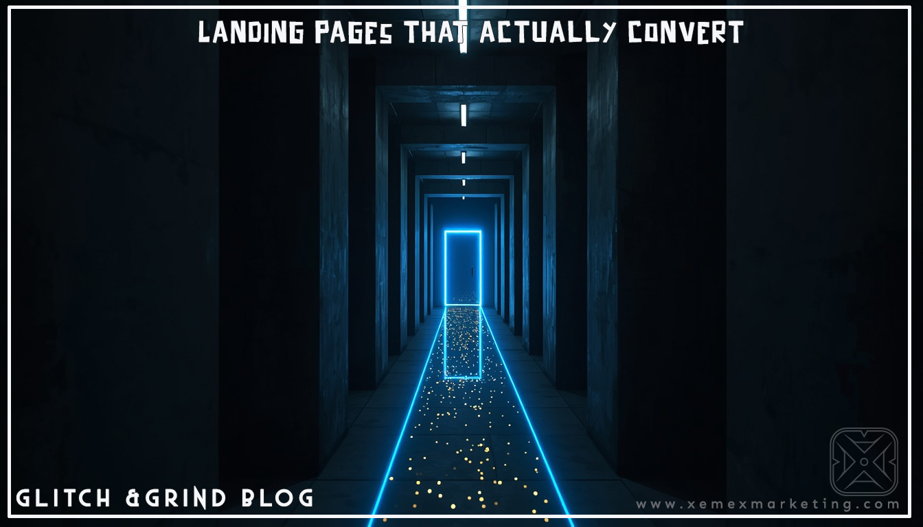

LANDING PAGES THAT ACTUALLY CONVERT: STOP SENDING PEOPLE TO YOUR HOMEPAGE
The biggest traffic mistake small businesses make isn’t getting people to their website—it’s sending them to the wrong page. At Xemex, we see it constantly: a business runs a great ad, posts killer content, drives traffic, and then sends everyone to their homepage. The homepage is trying to do everything at once. It’s your story, your services, your about page, your contact form, your blog—all fighting for attention. The result? Confusion. And confused people don’t convert.
A dedicated landing page—built for one specific goal—is the difference between traffic that bounces and traffic that converts.

WHAT IS A LANDING PAGE (AND WHY IS IT DIFFERENT)?
A landing page is a standalone web page designed for one specific purpose: getting a visitor to take one specific action.
Not your homepage. Not your services page. Not your about page.
One page. One goal. One action.
That action might be:
- Book a consultation
- Download a free resource
- Sign up for a webinar
- Claim a free audit
- Purchase a product
- Subscribe to a newsletter
Everything on the landing page—the headline, the copy, the images, the CTA—is designed to lead the visitor toward that one action. Nothing else. No distractions. No navigation menu pulling them away.
THE ANATOMY OF A HIGH-CONVERTING LANDING PAGE
Let’s break down every element that goes into a landing page that actually works:
1. THE HEADLINE (MAKE OR BREAK)
Your headline is the first thing people read. If it doesn’t hook them immediately, they’re gone.
A great headline does three things:
- Identifies the audience (“For Denver small businesses who…”)
- States the value clearly (“…ready to dominate their market”)
- Creates curiosity or urgency (“…without spending a fortune on ads”)
Weak headline: “Welcome to Xemex Marketing”
Strong headline: “Get More Leads, More Clients, and More Revenue — Without Burning Out on Content”
The strong headline speaks directly to the reader’s pain point and desired outcome. The weak headline is about you, not them.
2. THE SUBHEADLINE (SUPPORT AND EXPAND)
The subheadline sits directly below your main headline and provides supporting context. It’s where you explain how you deliver on the promise of the headline.
Example:
Headline: “Get More Leads Without Burning Out on Content”
Subheadline: “Our :57SecondPULSE service creates high-impact video content that works 24/7 — so you can focus on running your business while we handle the marketing.”
3. THE HERO IMAGE OR VIDEO
The visual element at the top of your landing page sets the tone. Options:
- A professional photo showing your product, service, or team in action
- A short video (60-90 seconds) explaining your offer — this can dramatically increase conversions
- A before/after image showing transformation
Pro tip: A :57SecondPULSE video embedded at the top of your landing page is one of the highest-converting elements you can add. Video builds trust instantly.

4. THE BENEFITS SECTION (NOT FEATURES — BENEFITS)
Most businesses list features. “We offer monthly reporting, 24/7 support, and custom strategies.” Nobody cares about features. They care about what features do for them.
Features tell. Benefits sell.
Feature: Monthly analytics reporting
Benefit: Know exactly what’s working so you never waste money on strategies that don’t convert
Feature: Custom content strategy
Benefit: Stop guessing what to post and start showing up with content your audience actually wants
Present your top 3-5 benefits as simple, scannable points with short explanations.
5. SOCIAL PROOF (TRUST TRIGGERS)
People don’t trust businesses. They trust other people. Social proof tells visitors “others have taken this leap and it worked out.”
Forms of social proof:
- Testimonials: Real quotes from real clients (with photos and names)
- Case studies: Before/after stories with specific results and numbers
- Logos: “Trusted by” section showing brands you’ve worked with
- Review scores: “4.9 stars on Google” with a link to your reviews
- Numbers: “50+ small businesses served” or “10,000+ views generated”
Pro tip: Specific testimonials convert better than generic ones. “Xemex helped my business grow” is weak. “Three months after working with Xemex, my website traffic doubled and I booked 8 new clients” is powerful.
6. THE OFFER (MAKE IT IRRESISTIBLE)
What exactly are you asking people to do? And why should they do it now?
Your offer needs to:
- Be crystal clear (no ambiguity about what they’re getting)
- Be valuable (worth more than the friction of signing up)
- Have low risk (free, no credit card, no commitment)
Example offers that convert:
- Free 30-minute strategy session
- Free website and social media audit
- Free downloadable guide or checklist
- Free first month with no commitment
- Free :57SecondPULSE video consultation
The word “free” is still the most powerful word in marketing. Use it when you mean it.
7. THE CALL TO ACTION (ONE BUTTON, ONE GOAL)
Your CTA button is where conversion happens. Get it right.
CTA best practices:
- Use action verbs: “Get My Free Audit” not “Submit”
- Be specific: “Book My Free Call” not “Contact Us”
- Create urgency: “Claim My Spot” or “Get Started Today”
- Make it visible: High-contrast button color that stands out from everything else
- Repeat it: Place your CTA at the top, middle, and bottom of the page
Weak CTAs: Submit | Learn More | Contact | Click Here
Strong CTAs: Get My Free Audit | Book My Strategy Call | Claim My Free Video | Start Growing Today
8. THE FORM (KEEP IT SIMPLE)
If you’re collecting information, less is more. Every field you add reduces conversion rates.
For a consultation landing page: Name + Email + Phone = enough
For a content download: Name + Email = enough
For a purchase: Only what’s needed to complete the transaction
Don’t ask for information you don’t need yet. You can collect more later.
9. REMOVING DISTRACTIONS (THIS IS CRITICAL)
A landing page should NOT have:
- A navigation menu (gives people an escape route)
- Links to other pages
- Social media icons in the header
- Competing offers or multiple CTAs
Every element on your landing page should serve one purpose: moving the visitor toward your single CTA. Everything else is a distraction.
10. MOBILE OPTIMIZATION
More than 60% of your traffic is coming from phones. Your landing page must be:
- Fast loading (under 3 seconds)
- Easy to read on a small screen
- Have a button large enough to tap easily
- Not require pinching or zooming
Test your landing page on your own phone before you run traffic to it.

LANDING PAGE TOOLS FOR SMALL BUSINESSES
You don’t need to be a developer to build a high-converting landing page. These tools make it accessible:
BEGINNER-FRIENDLY:
- Carrd — Simple, free, great for single-page sites
- Linktree (Pro) — Basic landing page functionality
- Mailchimp — Built-in landing pages with email capture
INTERMEDIATE:
- Squarespace — Clean templates, easy editing
- Wix — Flexible drag-and-drop with landing page templates
- ConvertKit — Built specifically for email capture and lead generation
ADVANCED:
- Unbounce — Purpose-built for landing pages, A/B testing included
- ClickFunnels — Full funnel builder, more complex but powerful
- Leadpages — Fast, optimized templates with conversion analytics
THE TESTING MINDSET: ALWAYS BE OPTIMIZING
No landing page is ever “done.” The best marketers treat landing pages as experiments.
A/B TESTING BASICS:
Create two versions of your landing page with one difference (different headline, different CTA, different image). Split your traffic 50/50. After enough data (100+ visits per version), see which converts better. Keep the winner. Test again.
Even small changes can make massive differences:
- Changing a CTA from “Submit” to “Get My Free Audit” can increase conversions by 30%+
- Adding a testimonial above the fold can increase trust and conversions significantly
- Removing the navigation menu typically increases conversions by 10-20%
What to test (one thing at a time):
- Headline variations
- CTA copy and color
- Hero image vs. video
- Form length
- Offer positioning
- Social proof placement
THE XEMEX EDGE: WE BUILD LANDING PAGES THAT CLOSE
At Xemex, we don’t just design landing pages that look good — we build landing pages that convert. Every element is intentional. Every word earns its place. Every CTA is designed to move visitors from curious to committed.
Combined with a :57SecondPULSE video at the top of your page and a strategic offer that removes all risk, we build conversion machines that work while you sleep.
JOIN THE GRIND: WHAT’S YOUR CURRENT LANDING PAGE SITUATION?
Thanks for grinding with us through another GLiTCH &GRiND post. We’re all about helping Denver businesses turn their digital presence into a revenue engine.
Do you have a dedicated landing page for your main offer? If yes, what’s your conversion rate? If no, what’s been holding you back from building one? Drop a comment below — let’s troubleshoot your conversion strategy together.