
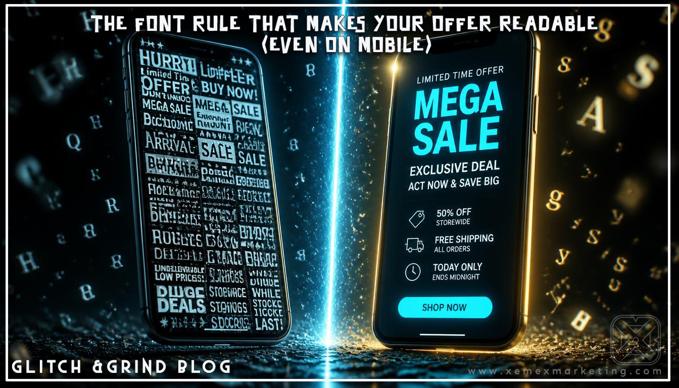

THE FONT RULE THAT MAKES YOUR OFFER READABLE (EVEN ON MOBILE)
Your landing page or promo might have the right idea—but if the font is wrong, the message fails. The biggest design glitch isn’t “bad branding.” It’s unreadable hierarchy. People can’t understand the offer fast enough, so they bounce. That’s not a “design preference.” It’s a conversion problem.
Silent anthem time: today we’re fixing the font rule that separates “professional” from “confusing,” especially for small business owners who don’t have graphic design sense.
In plain language: your font needs to tell people what matters first. Not second. First.
BRUTAL TRUTH: If your font doesn’t create instant hierarchy, your customer has to work—and most won’t.

THE PROBLEM BREAKDOWN
WHY FONTS KILL CONVERSION (WITHOUT ANYONE NOTICING)
When text is:
- too small
- too close together
- too many styles
- too similar in weight
…your page becomes “pretty noise.”
Even if the content is correct, people can’t process it quickly. In Denver, where people decide quickly, this hits harder because competition is everywhere.
THE REAL CUSTOMER EXPERIENCE
Your customer is on mobile, distracted, and scanning. If your font doesn’t make the offer obvious in a glance, they leave. The design isn’t the problem—the lack of clarity is.
THE FONT RULE (THE BLUEPRINT)
TIP 1: USE ONE MAIN FONT + ONE ACCENT FONT (MAX)
Rule of thumb:
- Pick a clean readable font for body text
- Pick a matching accent font for headings (or use bold variations)
- Don’t mix 4 fonts just because you can
Why it works: it reduces cognitive load.
TIP 2: SET A CLEAR FONT-SIZE HIERARCHY
A simple mobile-first hierarchy:
- Headline: biggest text on the page
- Subhead: smaller but still bold/clear
- Body: comfortable to read without zooming
- CTA button text: the most readable text after the headline
Pro tip: if you need to “tell” people where to look, your font hierarchy is broken.
TIP 3: WATCH LINE LENGTH AND SPACING
Too tight = fatigue. Too loose = disjointed reading.
Use:
- comfortable line spacing
- consistent paragraph rhythm
- avoid long blocks of text
Why it matters: readers stay longer when reading is easy.
TIP 4: MAKE YOUR CTA BUTTON TEXT STAND OUT
Your CTA should be obvious even if someone looks at it for one second. Use:
- high contrast button color
- bold button text
- short action wording (Book Now, Get Quote, Schedule Call)
Why it works: CTA readability increases clicks without changing the page layout.
COMMON MISTAKES TO AVOID
- Using decorative fonts for body text
- Headings that aren’t bigger than everything else
- CTA buttons that are visually “meh”
- Multiple font weights that look like accidental formatting
DENVER EXAMPLE
Let’s say you’re a Denver contractor with a landing page. You wrote a strong offer, but the font sizes are tight and the CTA looks like a normal link. Result: fewer clicks, fewer calls. Same offer, worse legibility. Fix the hierarchy and the page becomes a “yes” faster.
THE XEMEX EDGE
At Xemex, we build design-to-conversion clarity so your message is readable, trustworthy, and action-oriented. Whether it’s typography hierarchy, landing page structure, or offer framing, we help you create mission-driven momentum that turns visitors into booked leads. And since this is core to visibility, the design support connects directly to your broader marketing system (so you’re not fixing only aesthetics—you’re fixing results).
JOIN THE GRIND
Thanks for grinding with us through another GLiTCH &GRiND post. We’re helping small businesses look professional and convert like it.
What’s the font problem you’re dealing with right now—too small text, unclear headings, or a CTA that blends in?




Leave a Reply